Good sites!
Anipan
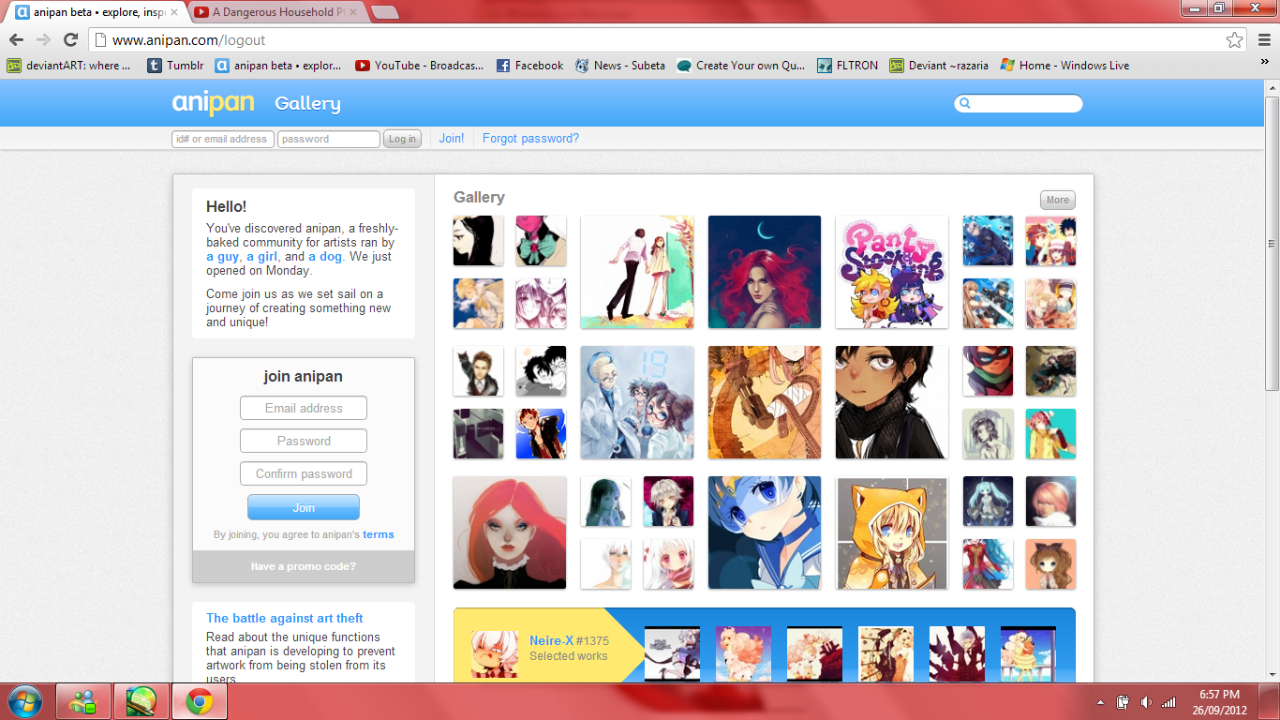
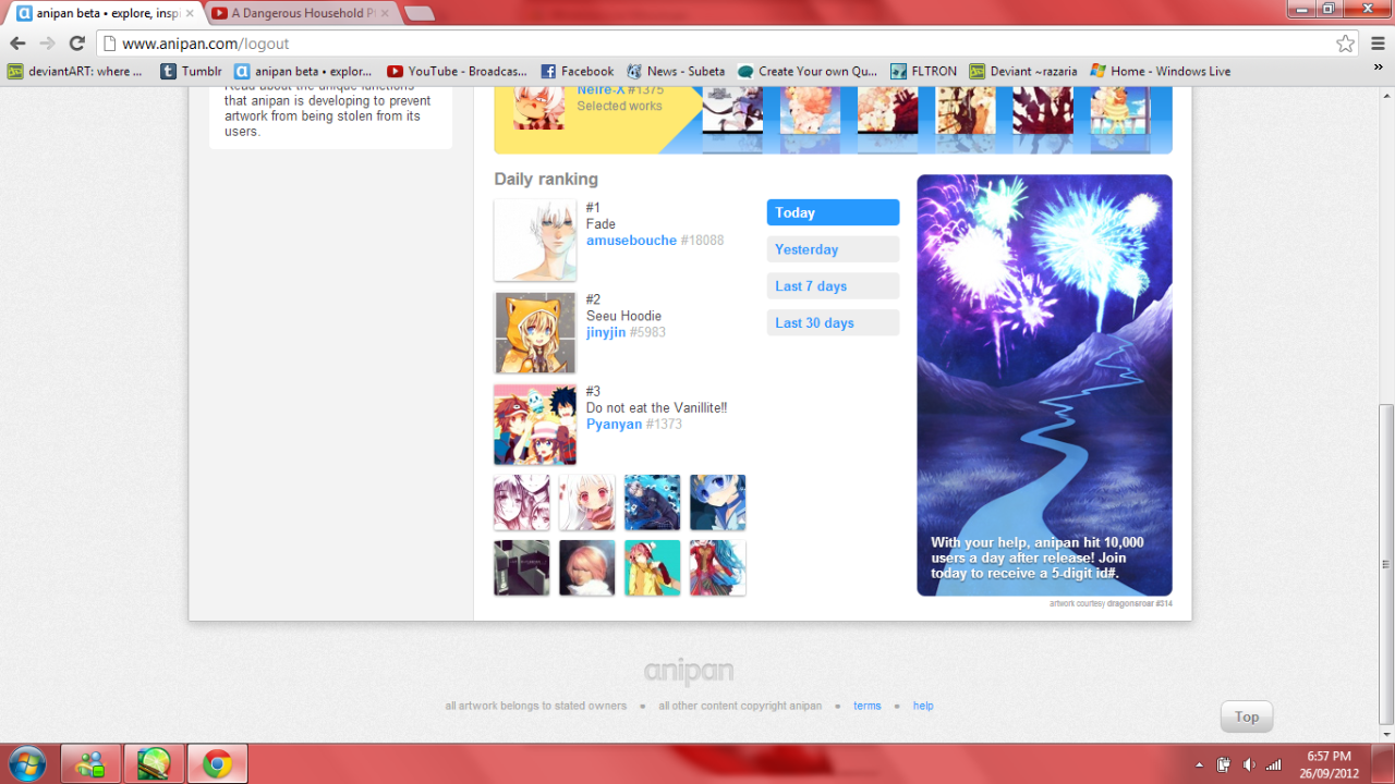
Anipan is a Canadian art site. It may be newer but it is very easy to work with. It has the newer drawings on the front page in small boxes and the bigger boxes on the front page are the most 'loved' within the 24 hours. They also have three of the most loved drawings in 1. that day, 2. yesterday, 3. over a week and 4.A month. The background is white and the printing black, links are blue and stand out easily. There are easy to find log in and join options and it's over all well put together.
However, on some computers the lining up of the information bars in the 'join Anipan' section is a little off. Though, they are still adding on and fixing this site.
Anipan is aimed at a teen/young adult artistic audience and probably attracts these people due to the art always being featured, it's always changing.
*it doesn't seem to work on these mac computers. It works my PC though!
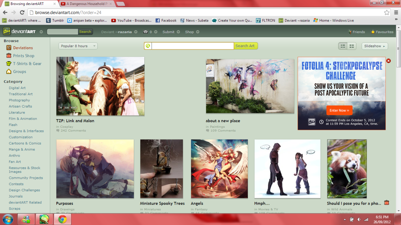
Deviantart
Deviantart is another art site that is more focused on young artists. You can pick what font page you see--either newest or most popular in a given amount of time. This site is much bigger than Anipan and much older and the newest drawings/photos/ect are often pushed off rather quickly. This site still allows for more than just drawing artists to post. It allows for short stories, poems, painting, digital paintings, photography, and so much more to be posted.
The colour scheme is also well put together. All is based off of a white and aqua-green colour scheme. Dark backgrounds have light writing and vice-versa.
Everything is easy to find and put in logical places and catagorized--nothing is jumbled.
The only flaw is that the newest page moves too fast, however there isn't much the site can do about that.
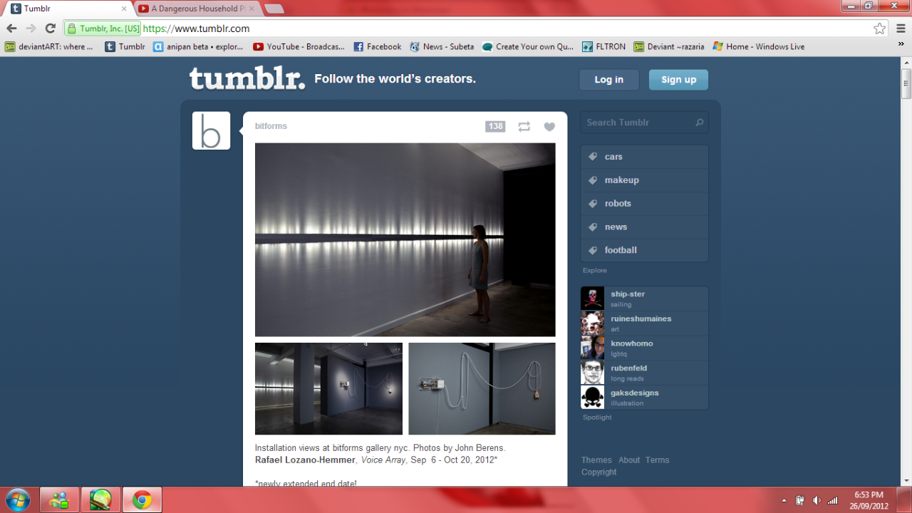
Tumblr
Tumblr is a blogging site directed towards teens. Really, it's up to its audience what appears on their on their page. They can follow whoever's blog they want and post whatever they want. You can see who posted something or the source of whatever was posted. Aside from the daily chosen photo on the side (from the staff) it's up to the user!
There is an easy to find 'search' bar so you can look through tags and find posts and people you like (eg. if you like cats you would look up cats. And my gosh, you'll get so many photos of cats). Your blog is in the top right and the home button on the top left. Everything else, asides from posts from people you follow, is on the right. That can be a little bit of an annoyance but it's an easy thing to get used to if you use it enough.
It's main theme is blue and white, making everything easy to read and see. The writing on the white 'dash board' is black and in an easy to read font. However, you can find and install different backgrounds and colours if you want.
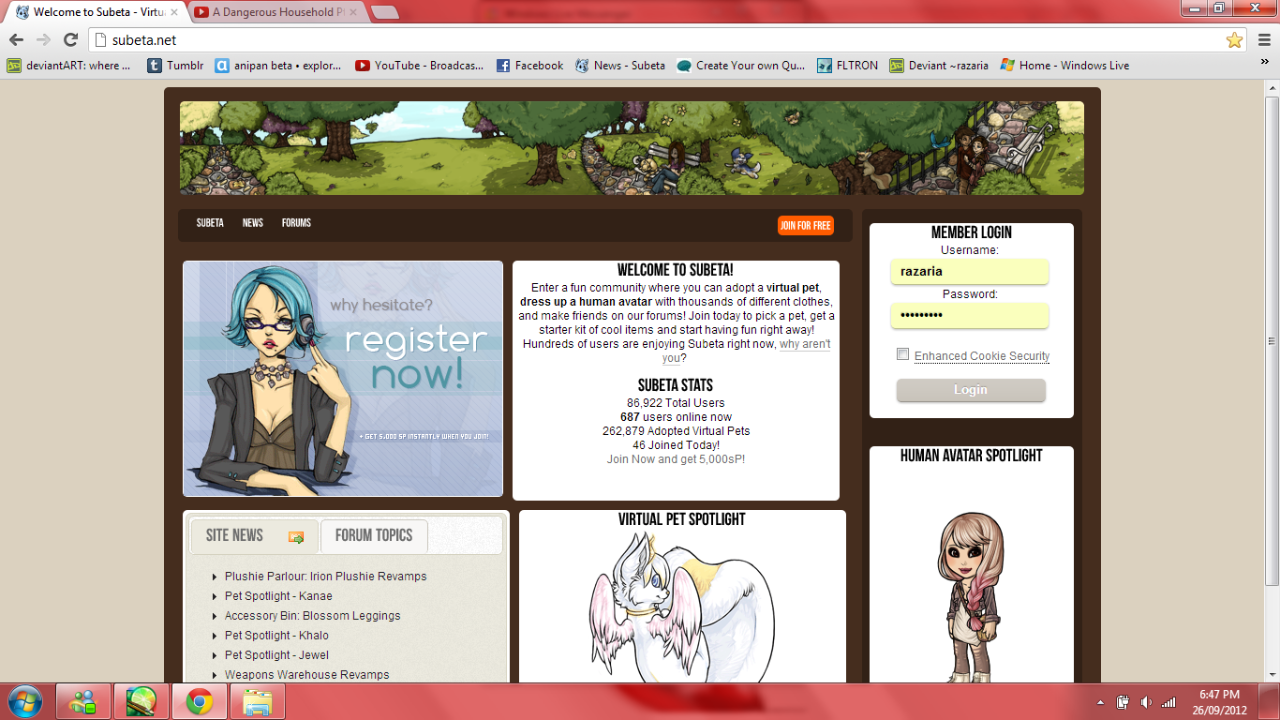
Oh my, a virtural pet site not for little kids!
This site looks rather childish at first glance but it's intended for people 13+. This childish look often drives people away, however. You basically look after creatures you call 'pets' and you can create/dress up a human avatar (I do have to say, some of the clothing you can use makes this an obvious no-no for young children). There are also forums to chat on (and freely swear on, another aspect that screams 'NOT FOR CHILDREN').
The theme is naturally brown and white however there are a number of different themes the user can change it too (blue and white, red and black, ect.).
It's big flaw is that it's page is rather cluttered, though finding the sign up button in bright orange is no problem, but reading to actually see what the site is about is a problem. Also, it looks really childish and that would drive away most of the age group the site is meant for.