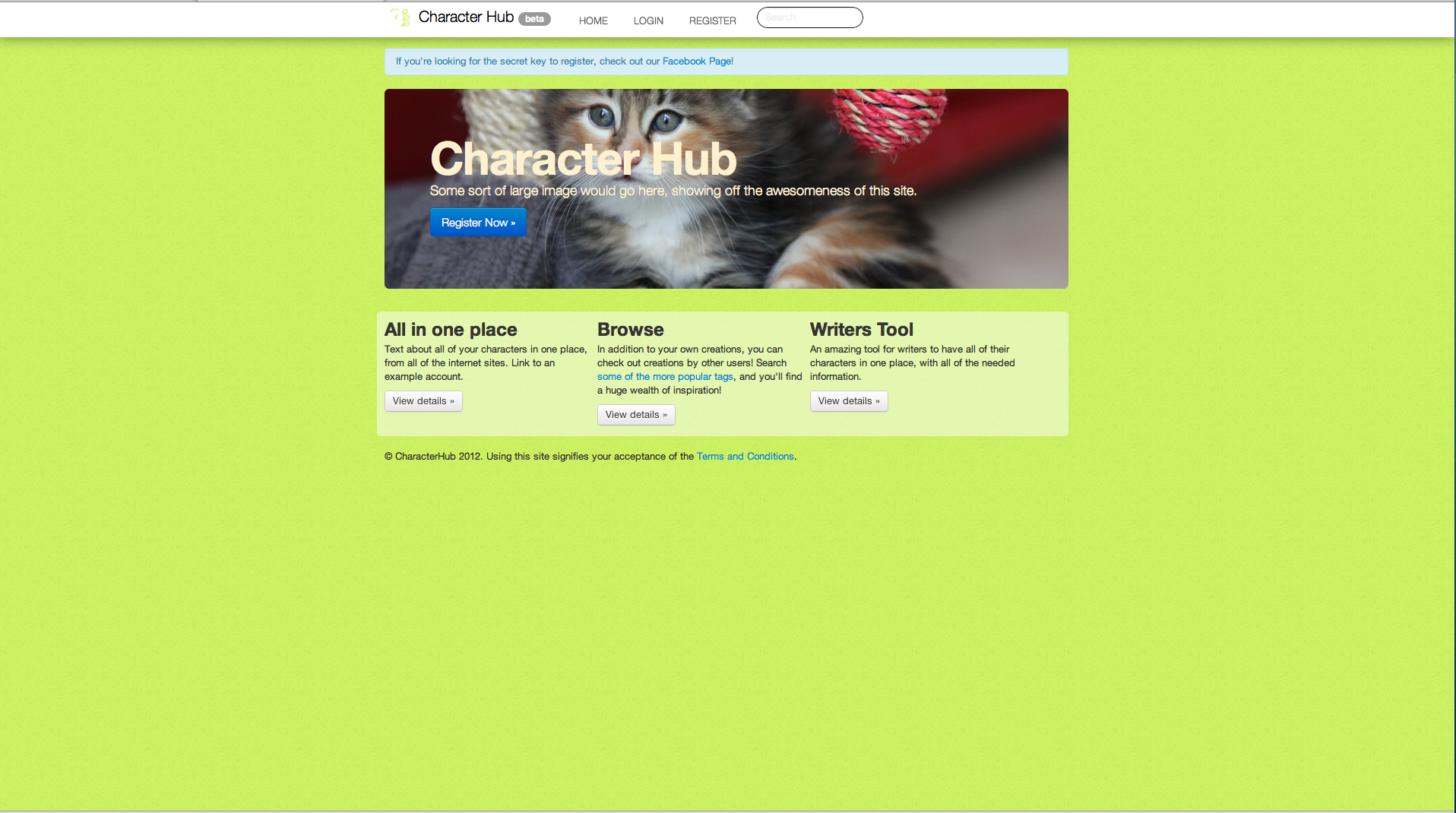
Bad sites!
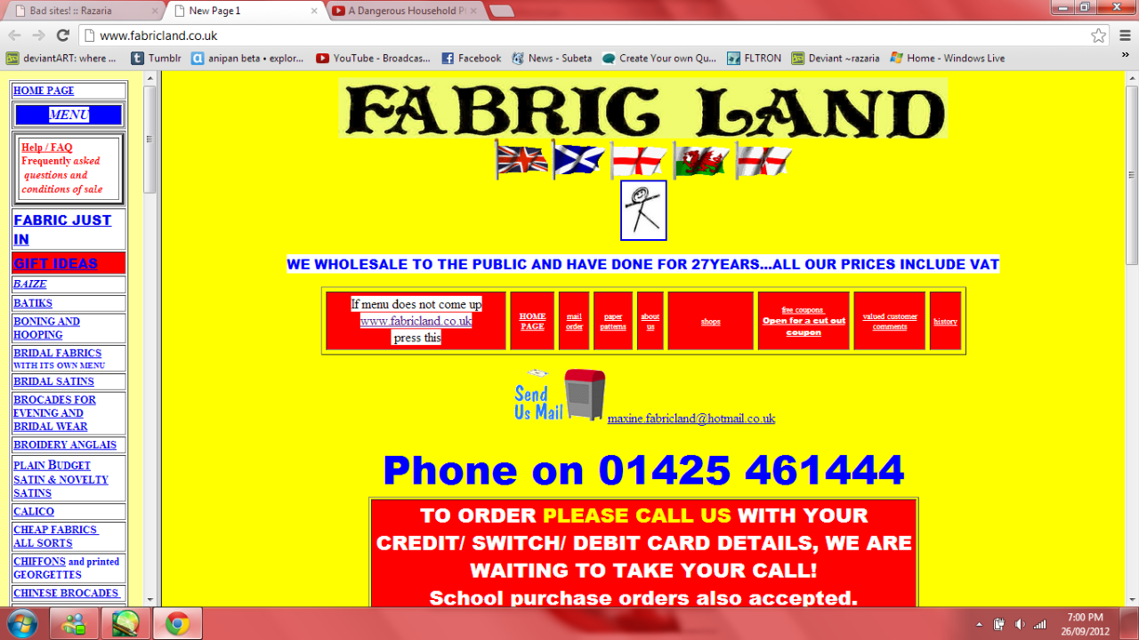
Fabricland UK
<https://www.fabricland.co.uk/>
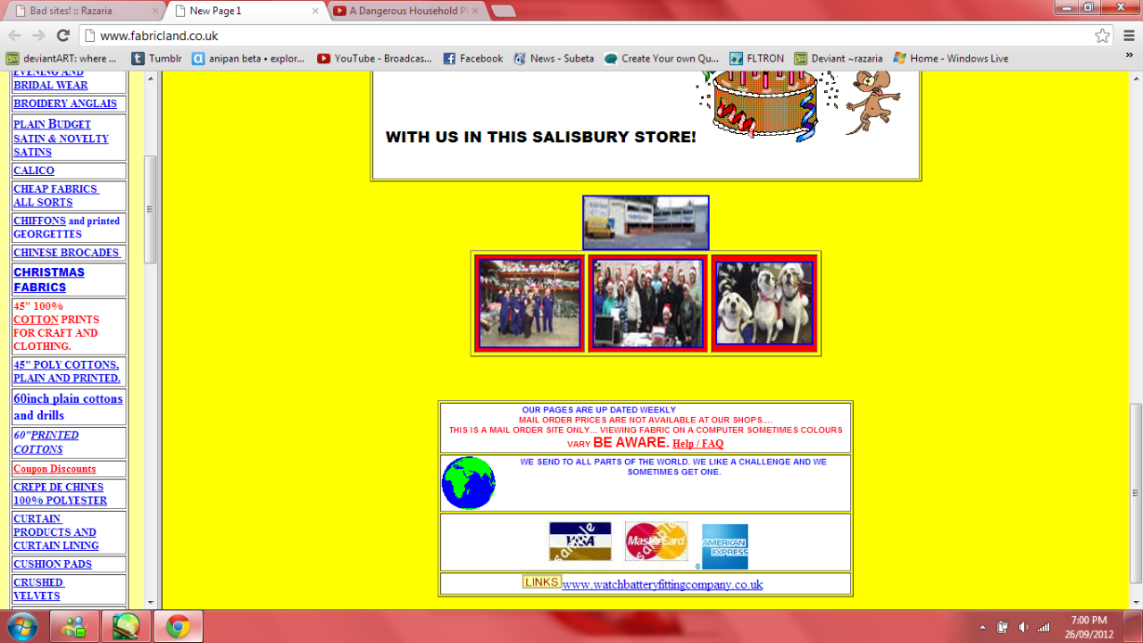
Where do I start? This entire site is a complete mess. The background is bright and hurts the eyes to look at. There are too many flash graphics, they just clutter the entire page, and there is not one dark or dull colour on the entire page (aside from the maybe two or three words in black)!
It looks like one of those pop ups you'd get when you get a virus, to be honest.
The side bar may have everything, yes, but it has too much. It's in alphabetical order to the 'history' is somewhere between the names of fabrics, coupons between two types of cotton. It's just a confusing and terrible site. Fabricland's US site is much better in comparison. Maybe they should take a few website ideas from them.
Suicidehotlines
<https://suicidehotlines.com/>
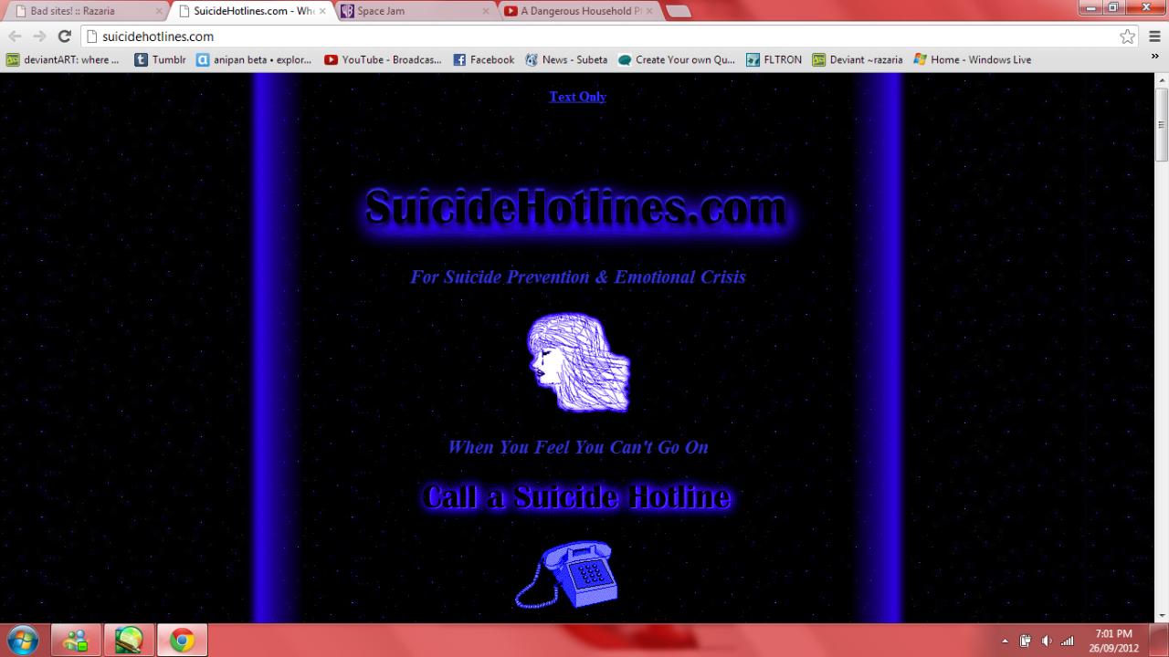
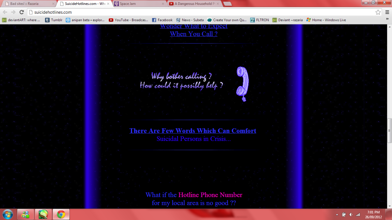
Now, I feel terrible for hating on this site, they really mean well--but if you feel like killing yourself please call, don't go to this site. It may just depress you more.
The colours consist of blacks and semi-dark blues. Actually, it looks like they had a colour wheel and just took the most deep blue they could find.
The drawing looks like it was done in a cheap paint program. If you're making a site about such a serious subject, please make it good.
All the information seems to be on the first page, no real links to other pages--expect to the hotlines in your state section, the states are clickable, the section however is also on the front page. You just have to scroll and hope you find what you're looking for.
SpaceJam
<https://www2.warnerbros.com/spacejam/movie/jam.htm>
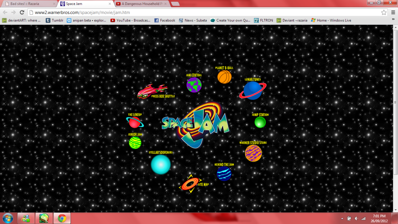
Oh, I'm sure at first this it looks fine and easy for children and for children, the from the first page I admit, it's a good kid's site. However, once you click a link I beg of you make it a normal page!
Go ahead, click the little green and yellow planet.
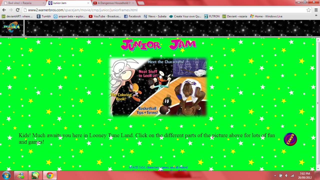
Terrible. The background is an eyesore and the stars are no longer nesaisary, the big pink print clashes with the background, only hurting your eyes more. And to be quite frank, if you're going to have graphics on a page you don't need a complex background and bright colours to draw away from them. this page would scare any child away from the site.
Character Hub
Now, I do like the concept idea of this site. It's a site where you can upload your own characters to have an easy reference for them. But, really, as cute as kittens are, it doesn't make sense to have put one on the main page. I mean, I get that it's also a new site and they may not know what to put as a banner, but they could have left it blank. It doesn't give a clear idea to what it is the site is.
None of the buttons work, except the join, login and forums (and the terms and conditions that are all of four points). You cannot read anything more about this site, really. Just the few bottom captions.